You’re spending money on Google Ads or Facebook advertising. People click through to your website. Then they leave without calling, filling out a form, or taking any action. That’s not a traffic problem—it’s a landing page problem.
A landing page is any page where visitors arrive after clicking an ad, email link, or search result. Unlike your homepage (which tries to serve everyone), a landing page has one job: convince visitors to take a specific action. When designed well, landing pages can double or triple your conversion rates compared to sending traffic to generic website pages.
For Western Sydney small businesses, effective landing pages mean getting more leads from the same advertising budget. This guide shows you how to design landing pages that actually convert, without needing a degree in marketing or web design.
What Makes a Landing Page Different
Before we dive into design principles, let’s understand what separates landing pages from regular website pages.
Regular Website Page vs Landing Page
Your typical service page tries to cover everything: all your services, your history, testimonials, contact details, and links to other pages. It’s designed for browsing.
A landing page is laser-focused. One offer. One audience. One action. Someone searching “emergency plumber Parramatta” doesn’t need your company history—they need to know you can help them right now and how to reach you.
The Focused Approach
Effective landing pages remove distractions:
- No main navigation menu (or a simplified version)
- No links to other services
- No competing calls to action
- Everything points toward one goal
This focus feels counterintuitive—surely more information is better? But research consistently shows that fewer options lead to more conversions. When you give visitors ten things to click, they often click nothing. When you give them one clear option, they take it.
The Anatomy of a High-Converting Landing Page
Every effective landing page includes these core elements. Let’s walk through each one.
1. A Headline That Matches the Source
Your headline must immediately confirm that visitors are in the right place. If someone clicks an ad saying “Fast Hot Water Repairs Castle Hill,” your landing page headline should echo that promise.
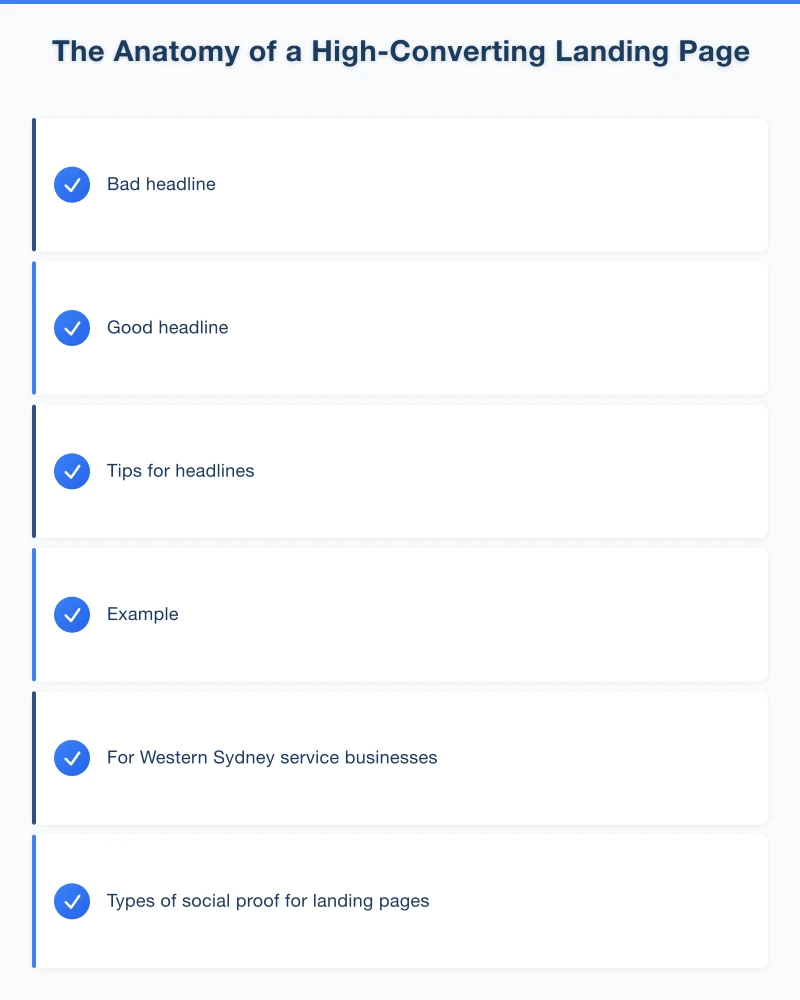
Bad headline: “Welcome to ABC Plumbing” Good headline: “Fast Hot Water Repairs in Castle Hill - Same Day Service”
The visitor sees continuity between what they clicked and where they landed. That match builds trust and keeps them reading.
Tips for headlines:
- Keep it under 10 words
- Include the main benefit
- Use specific language (not generic platitudes)
- Echo the ad or search term that brought them here
2. A Subheadline That Supports
Your subheadline expands on the headline with additional detail. It should strengthen the value proposition and draw visitors into the page.
Example: “Local plumbers serving the Hills District for over 15 years. We arrive within 2 hours or the callout is free.”
The subheadline adds credibility (15 years, local) and a guarantee (2 hours or free). Now the visitor has reasons to keep reading.
3. A Hero Image or Video That Builds Trust
Visuals grab attention faster than text. Your hero section should include:
- A relevant image (your team, your work, your products)
- Real photos, not obvious stock images
- Professional quality that reflects your business quality
For Western Sydney service businesses, consider:
- Team photo in front of a recognisable local landmark
- Before/after shots of local work
- Your service vehicle clearly showing branding
Video can be even more effective. A 60-second video of you introducing yourself and your services builds connection faster than any amount of text.
4. Social Proof That Removes Doubt
Visitors wonder: “Can I trust this business?” Social proof answers that question.
Types of social proof for landing pages:
- Star rating and review count (“4.9 stars from 127 Google reviews”)
- Customer testimonials with names and photos
- Logos of businesses you’ve worked with
- Industry certifications and memberships
- Media mentions or awards
For local businesses, testimonials from recognisable local customers or businesses carry extra weight. “John helped us with our cafe fit-out in Parramatta—highly recommend!” feels more relevant to a Western Sydney visitor than a generic testimonial.
5. Benefits-Focused Copy
Most business websites talk about features: what you do, how you do it, your equipment, your processes. Landing pages should talk about benefits: what the customer gets.
Feature: “We use German-engineered hot water systems” Benefit: “Enjoy reliable hot water for 15+ years with our premium systems”
Feature: “Licensed and insured electricians” Benefit: “Rest easy knowing your family’s safety is protected by fully licensed, insured professionals”
Write from the customer’s perspective. They don’t care about your equipment—they care about their hot shower working tomorrow morning.
6. A Clear, Compelling Call to Action
Your call to action (CTA) is the specific action you want visitors to take. It should be:
Visible: Above the fold (visible without scrolling) and repeated throughout the page Specific: “Get Your Free Quote” beats “Submit” Action-oriented: Start with a verb Low-friction: Ask for the minimum information needed
Strong CTAs for local businesses:
- “Get Your Free Quote in 2 Hours”
- “Book Your Free Consultation”
- “Call Now for Same-Day Service”
- “Request a Callback”
Use contrasting colours for CTA buttons so they stand out from the page. If your page is blue, an orange or green button catches the eye.
7. A Simple, Focused Form
If your CTA involves a form, keep it short. Every field you add reduces completions.
For most service businesses, ask only:
- Name
- Phone number
- Brief description of what they need
That’s it. You can get more details when you call them back. A 10-field form might feel thorough to you, but visitors see it as a barrier.
Pro Tip: Consider offering multiple contact options. Some people prefer forms, others want to call, some might use chat. Let them choose their preferred method.
8. Trust Signals and Guarantees
Remove remaining objections with trust signals:
- “Satisfaction guaranteed or your money back”
- “No hidden fees—we quote upfront”
- “Serving Hills District families since 2008”
- Secure payment badges (if collecting payments)
- Privacy statement for forms
Guarantees reduce perceived risk. If you can offer any kind of guarantee, feature it prominently.
Landing Page Design Best Practices
Beyond the elements, how you arrange and present them matters.
Visual Hierarchy
Guide the visitor’s eye down the page in a logical flow:
- Headline (what’s this about?)
- Subheadline (why should I care?)
- Hero image (visual confirmation)
- Benefits (what do I get?)
- Social proof (can I trust them?)
- CTA (what do I do next?)
Use size, colour, and spacing to create clear visual hierarchy. Important elements should be larger and more prominent.
Mobile-First Design
Over 60% of landing page visitors are on mobile devices. Your page must work perfectly on phones:
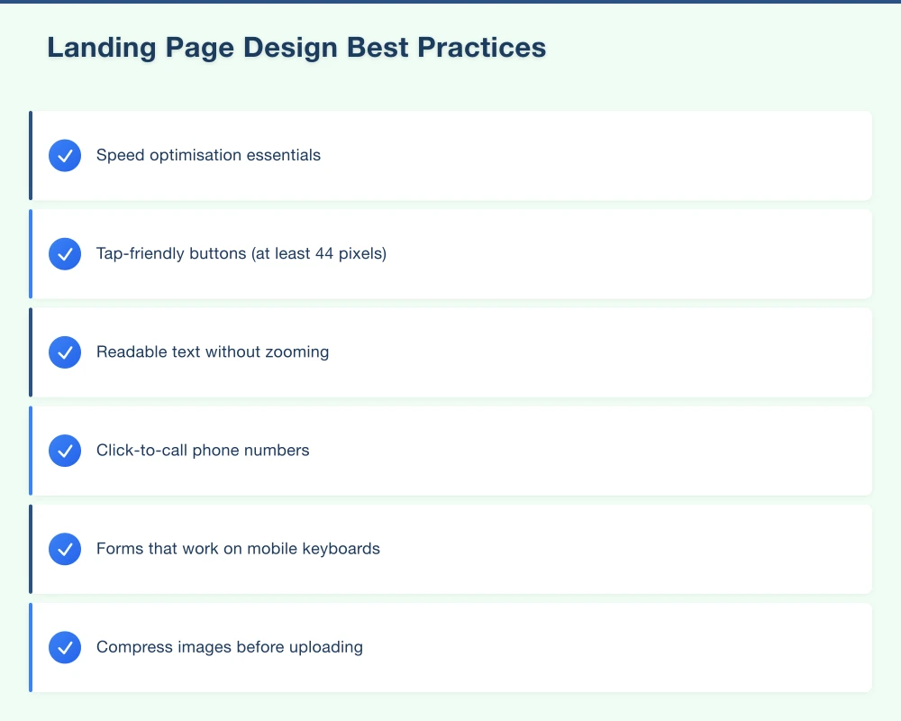
- Tap-friendly buttons (at least 44 pixels)
- Readable text without zooming
- Click-to-call phone numbers
- Forms that work on mobile keyboards
Test your landing page on an actual phone before launching any campaign.
Loading Speed
Slow pages kill conversions. Every second of delay reduces conversions by approximately 7%. For a page that generates 100 leads per month, a 2-second delay could cost you 14 leads.
Speed optimisation essentials:
- Compress images before uploading
- Minimise unnecessary scripts
- Use fast, quality hosting
- Test with Google PageSpeed Insights
Minimal Navigation
Traditional website navigation gives visitors escape routes. On landing pages, remove or minimise navigation:
- No main menu, or a much simplified version
- No footer links to other pages
- All links point to the CTA
The only action you want visitors to take is your conversion goal. Don’t give them alternatives.
Creating Landing Pages for Different Campaign Types
Different advertising goals need different landing page approaches.
For Google Ads (Search)
People searching on Google have specific intent. Your landing page should:
- Match the exact search term in your headline
- Get straight to the point
- Provide your phone number prominently (searchers often want to call immediately)
- Include local references (suburb names, “Western Sydney”)
For Facebook Ads
Facebook users weren’t actively searching for you—they were browsing and your ad caught their attention. Your landing page should:
- Re-engage them with the same visual/hook from the ad
- Build more interest before asking for action
- Use more emotional appeals
- Work with potentially lower intent visitors
For Email Campaigns
Email subscribers already know you. Landing pages for email traffic can:
- Reference the email content directly
- Use less introductory material
- Offer exclusive deals (since they’re existing contacts)
- Assume more familiarity with your business
Testing and Improving Your Landing Pages
Your first landing page won’t be your best. Testing reveals what actually works with your audience.
What to Test
Headlines: Test different benefits, different wording, question vs statement CTAs: Different button text, colours, placement Form length: More fields vs fewer fields Images: Different photos, with/without people, video vs static Social proof: Different testimonials, reviews vs testimonials
How to Test
A/B testing: Show half your visitors version A, half version B. Measure which converts better. Tools like Google Optimize (free) make this straightforward.
Sequential testing: Run version A for two weeks, measure results. Then run version B for two weeks. Compare. Less scientific but simpler.
Key Metrics to Track
Conversion rate: Percentage of visitors who complete your goal action Bounce rate: Percentage who leave without any interaction Time on page: How long visitors spend reading Form abandonment: How many start but don’t finish your form
Aim for continuous improvement. A landing page converting at 3% today could convert at 5% with testing—that’s a 67% increase in leads from the same traffic.
Tools for Creating Landing Pages
You don’t need custom development for effective landing pages.
Website Platform Features
WordPress: Plugins like Elementor, Beaver Builder, or SeedProd include landing page templates
Wix: Built-in landing page templates in the template library
Squarespace: Cover pages and simplified templates work for landing pages
Dedicated Landing Page Tools
Unbounce: Purpose-built for landing pages, includes A/B testing ($99+/month)
Leadpages: Easy landing page builder with templates ($37+/month)
Instapage: Advanced features for high-volume campaigns ($199+/month)
For most Western Sydney small businesses, your existing website platform with a landing page plugin provides everything you need.
Your Landing Page Action Plan
Week 1: Identify your most important conversion goal (phone calls, quote requests, bookings)
Week 2: Write your landing page copy
- Headline matching your top ad or search term
- 3-5 key benefits
- 2-3 testimonials
- Clear CTA
Week 3: Build your landing page
- Use your website platform or a landing page tool
- Keep design clean and focused
- Test on mobile
Week 4: Launch and measure
- Connect to your advertising campaigns
- Set up conversion tracking
- Establish baseline metrics
Ongoing: Test and improve
- Try different headlines
- Experiment with CTAs
- Continuously optimise based on data
Landing Pages That Work for Western Sydney Businesses
Local businesses have unique advantages on landing pages. You can:
- Reference specific suburbs and areas
- Mention local landmarks and context
- Feature testimonials from local customers
- Emphasise local availability and fast response
A Blacktown electrician competing against big national companies can use local focus as a differentiator: “Your Hills District neighbours trust us—read their reviews.”
Your advertising brings visitors to the door. Your landing page invites them in and converts them into customers. Give that page the attention it deserves, and watch your marketing results transform.
Need help creating landing pages that convert? Cosmos Web Technologies designs high-converting landing pages for Western Sydney businesses.
Your website’s performance depends on what’s behind it. Cloud Geeks provides the managed hosting, cloud, and IT support that keeps Australian SMBs online and secure.
Ash Ganda covers how Australian SMBs are using AI, automation, and digital strategy to grow without scaling costs proportionally.
If your business is also planning a customer-facing iOS or Android app — Awesome Apps builds cross-platform mobile apps for Australian SMBs.
Part of the Ganda Tech Services family, Cosmos Web Tech delivers specialist web design and digital marketing for Australian small and medium businesses.