Mobile-First Design: Why Your Website Must Work on Phones
Here is a number that should get your attention: over 55 percent of all web traffic in Australia now comes from mobile devices. For local businesses, that number can be even higher. When someone in Parramatta searches for “best pizza near me” at 7pm on a Friday, they are almost certainly doing it on their phone.
If your website does not work well on a mobile device, you are turning away more than half of your potential customers before they even have a chance to learn about your business.
What Is Mobile-First Design?
Mobile-first design means designing your website for mobile devices first, then scaling up for larger screens like tablets and desktops. This is the opposite of how websites were traditionally built, where the desktop version came first and the mobile version was an afterthought.
The logic is simple: if you design for the smallest screen first, you are forced to prioritise the most important content and features. Everything else is secondary.
Google has been using mobile-first indexing since 2019, which means it primarily uses the mobile version of your website for ranking and indexing. If your mobile experience is poor, your search rankings will suffer regardless of how good your desktop site looks.
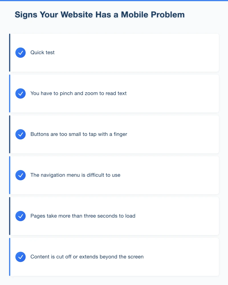
Signs Your Website Has a Mobile Problem
Not sure if your site has issues on mobile? Here are some red flags:
- You have to pinch and zoom to read text
- Buttons are too small to tap with a finger
- The navigation menu is difficult to use
- Pages take more than three seconds to load
- Content is cut off or extends beyond the screen
- Forms are frustrating to fill out
- Pop-ups cover the entire screen and are hard to dismiss
- Images are blurry or do not display correctly
Quick test: Pull out your phone right now and visit your website. Try to complete the most common action a customer would take, whether that is finding your phone number, filling out a contact form, or viewing your services. If it is frustrating, your customers feel the same way.
Key Elements of Mobile-Friendly Design
Responsive Layout
A responsive website automatically adjusts its layout to fit the screen size. Content reflows, images resize, and navigation adapts. This is the standard approach for modern websites and is far better than having a separate mobile site.
Touch-Friendly Navigation
On mobile, people navigate with their thumbs. Your menu, buttons, and links need to be large enough to tap without accidentally hitting the wrong thing. The recommended minimum tap target size is 44 by 44 pixels.
A hamburger menu (the three horizontal lines) is the standard mobile navigation pattern. It keeps the screen clean while giving access to all your pages.
Readable Text Without Zooming
Body text should be at least 16 pixels on mobile. Anything smaller forces people to zoom in, which is a frustrating experience. Use sufficient line spacing and keep paragraphs short for easier reading on small screens.
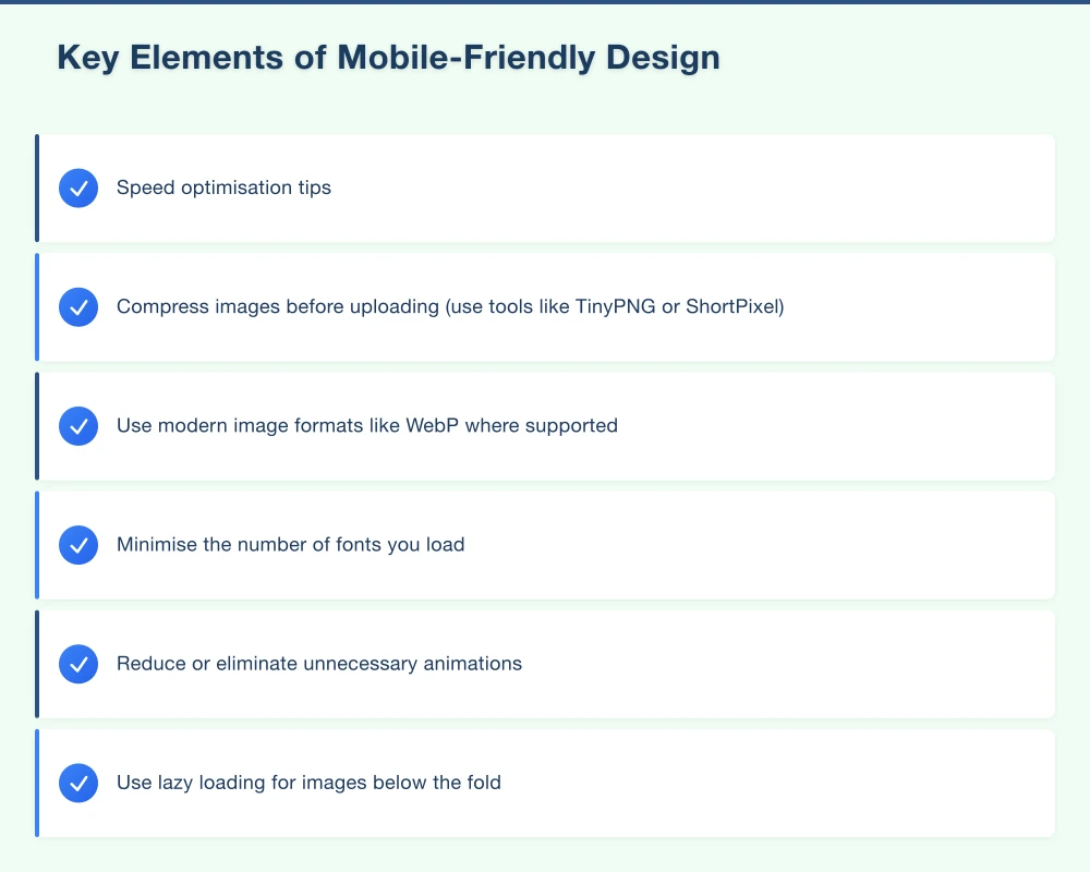
Fast Loading Speed
Mobile users are often on cellular networks, which can be slower than home broadband. Your site needs to load quickly even on a 4G connection.
Speed optimisation tips:
- Compress images before uploading (use tools like TinyPNG or ShortPixel)
- Use modern image formats like WebP where supported
- Minimise the number of fonts you load
- Reduce or eliminate unnecessary animations
- Use lazy loading for images below the fold
- Choose a hosting provider with Australian servers
Clickable Phone Numbers
For local businesses, this is essential. Your phone number should be a clickable link so mobile visitors can call you with a single tap. The HTML is simple: wrap your phone number in a “tel:” link.
Simplified Forms
Mobile forms should be as short as possible. Remove any fields that are not absolutely necessary. Use appropriate input types so the phone shows the right keyboard (number keyboard for phone fields, email keyboard for email fields).
No Intrusive Pop-ups
Google has been penalising websites that show intrusive interstitial pop-ups on mobile since 2017. If you use pop-ups, make sure they are easy to dismiss on mobile, do not cover the main content, and are not triggered immediately when the page loads.
Common Mobile Design Mistakes
Mistake 1: Hidden Contact Information
If your phone number is buried three taps deep in your mobile navigation, you are losing calls. Your primary contact information should be visible on every page, ideally as a sticky header or a floating call button.
Mistake 2: Desktop-Sized Images
Uploading large, unoptimised images and relying on the browser to resize them wastes bandwidth and slows your site. Always serve appropriately sized images for mobile devices.
Mistake 3: Horizontal Scrolling
Mobile websites should only scroll vertically. If your content extends beyond the right edge of the screen, something is wrong with your layout.
Mistake 4: Flash or Outdated Technology
Flash has not worked on mobile devices for years and is no longer supported by any major browser. If your website still uses Flash, it is well past time for a rebuild.
Mistake 5: Tiny Links Too Close Together
If text links are too small or too close to each other, mobile users will constantly tap the wrong one. Space links out and use buttons where possible.
Testing Your Mobile Experience
Google’s Mobile-Friendly Test
Visit search.google.com/test/mobile-friendly and enter your URL. Google will tell you whether your page is mobile-friendly and highlight any issues.
Google PageSpeed Insights
Visit pagespeed.web.dev and test your site. The mobile score is especially important. Aim for a score above 50, and ideally above 70.
Real Device Testing
There is no substitute for testing on actual phones. Ask friends and family with different phones (both iPhone and Android) to visit your site and give you honest feedback. Watch them try to complete common tasks.
Browser Developer Tools
In Chrome, you can press F12 (or right-click and select Inspect) and then click the device toggle to simulate different phone screens. This is not as reliable as testing on a real phone, but it is useful for quick checks.
The Business Impact of Mobile Optimisation
Getting mobile right is not just about aesthetics. It directly affects your bottom line:
Better search rankings: Google prioritises mobile-friendly websites in search results. If your competitors have mobile-friendly sites and you do not, they will outrank you.
Lower bounce rates: Visitors who have a good mobile experience stay longer and view more pages.
More conversions: A mobile-friendly site with clear CTAs and easy-to-use forms will generate more enquiries and sales.
Improved credibility: A professional, well-functioning mobile site builds trust. A broken or outdated mobile experience suggests your business is not keeping up.
What If Your Website Is Not Mobile-Friendly?
If your website was built more than four or five years ago and was not designed with mobile in mind, patching it is often more difficult and costly than rebuilding it on a modern, responsive platform.
Modern website platforms like WordPress (with a quality theme), Webflow, or custom-built solutions all produce responsive websites by default when built properly.
When considering a rebuild, prioritise:
- Responsive design that works on all screen sizes
- Fast loading times on mobile networks
- Clear, easy-to-tap calls to action
- Simple navigation
- Clickable phone numbers
- Easy-to-use contact forms
Take Action Today
- Test your website on your own phone right now
- Run the Google Mobile-Friendly Test
- Check your Google Analytics to see what percentage of your traffic is mobile
- Identify the biggest pain points for mobile users
- Plan improvements or a redesign if needed
Need a Mobile-Friendly Website?
At Cosmo Web Tech, every website we build is designed mobile-first. We create fast, responsive websites for Western Sydney businesses that look great and perform well on every device. If your current site is not cutting it on mobile, get in touch for a free consultation.
Your website’s performance depends on what’s behind it. Cloud Geeks provides the managed hosting, cloud, and IT support that keeps Australian SMBs online and secure.
Ash Ganda covers how Australian SMBs are using AI, automation, and digital strategy to grow without scaling costs proportionally.
If your business is also planning a customer-facing iOS or Android app — Awesome Apps builds cross-platform mobile apps for Australian SMBs.
Part of the Ganda Tech Services family, Cosmos Web Tech delivers specialist web design and digital marketing for Australian small and medium businesses.