Introduction
More than half of all website visits now come from mobile devices. For local businesses in Western Sydney, that percentage is often even higher—people searching for nearby services are usually on their phones.
If your website doesn’t work well on mobile, you’re losing customers before they ever contact you. This guide explains what mobile-friendly actually means and how to get there.
What Mobile-Friendly Really Means
It’s Not Just About Fitting the Screen
A truly mobile-friendly website:
Displays Properly
- Text is readable without zooming
- Images scale appropriately
- No horizontal scrolling needed
- Layout adapts to screen size
Functions Well
- Buttons are easy to tap
- Forms are simple to complete
- Phone numbers are clickable
- Maps and directions work
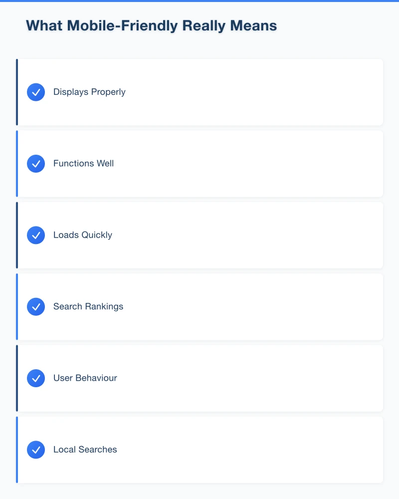
Loads Quickly
- Pages load in under 3 seconds
- Images are optimised
- No unnecessary elements
- Works on mobile data connections
Why It Matters for Local Business
Search Rankings
Google uses mobile-first indexing. Your mobile site is what Google evaluates for search rankings. A poor mobile experience means lower rankings.
User Behaviour
When someone searches “pizza near me” on their phone and lands on a slow, hard-to-navigate site, they hit the back button. Your competitor with the better mobile site gets the order.
Local Searches
“Near me” searches happen overwhelmingly on mobile devices. If you want local customers, mobile experience is essential.
Testing Your Current Site
Quick Self-Test
Open your website on your phone and try:
- Read the text—is it comfortable without zooming?
- Tap the menu—does it work smoothly?
- Fill out the contact form—is it frustrating?
- Click your phone number—does it dial?
- Find your address—can you get directions easily?
Google’s Mobile-Friendly Test
Use Google’s free tool:
- Go to search.google.com/test/mobile-friendly
- Enter your website URL
- Review the results
The tool shows:
- Whether Google considers your site mobile-friendly
- Specific issues detected
- Page loading issues
PageSpeed Insights
For more detail on speed:
- Go to pagespeed.web.dev
- Enter your URL
- Review mobile performance score
Look for:
- Performance score (aim for 50+, ideally 80+)
- Specific improvement recommendations
- Core Web Vitals metrics
Common Mobile Problems
Text Too Small
The Problem
Text designed for desktop becomes tiny on phones, forcing users to pinch and zoom.
The Fix
Use responsive typography:
- Minimum 16px font size for body text
- Adequate line height (1.5 or more)
- Sufficient contrast between text and background
Buttons and Links Too Close
The Problem
Interactive elements designed for mouse precision don’t work for finger taps. Users hit the wrong button.
The Fix
- Minimum tap target size of 44x44 pixels
- Adequate spacing between clickable elements
- Clear visual distinction for buttons
Images Not Optimised
The Problem
Large desktop images slow mobile loading dramatically. Users on mobile data give up waiting.
The Fix
- Compress images appropriately
- Use modern formats (WebP)
- Implement responsive images (different sizes for different devices)
- Consider lazy loading for below-the-fold images
Forms Too Complex
The Problem
Multi-field forms that are manageable on desktop become tedious on mobile. Auto-correct issues, tiny fields, and keyboard switching add friction.
The Fix
- Minimise required fields
- Use appropriate input types (email, phone, etc.)
- Make fields full-width on mobile
- Enable autocomplete where appropriate
- Show clear error messages
Fixed-Width Design
The Problem
Older websites built for a specific screen width don’t adapt to different devices.
The Fix
Responsive design using:
- Flexible grids
- Media queries
- Relative sizing (percentages, ems)
- Modern CSS frameworks
Practical Improvements
Quick Wins
Make Phone Numbers Clickable
Instead of just displaying your number, make it a tap-to-call link:
<a href="tel:0400000000">0400 000 000</a>Anyone on mobile can call with a single tap.
Add Click-to-Map
Link your address to Google Maps:
<a href="https://maps.google.com/?q=Your+Address+Here">
  Get Directions
</a>
Simplify Navigation
On mobile, streamlined navigation works better:
- Hamburger menu for secondary pages
- Most important actions always visible
- Clear back/home options
Speed Improvements
Optimise Images
- Compress using tools like TinyPNG or Squoosh
- Resize to actual display dimensions
- Use modern formats where supported
Reduce Plugins
If using WordPress or similar:
- Audit installed plugins
- Remove unused ones
- Choose lightweight alternatives
Enable Caching
Work with your hosting provider or developer to:
- Enable browser caching
- Use a content delivery network (CDN)
- Optimise server response times
Content Adjustments
Prioritise Mobile Content
What do mobile users need most?
- Contact information
- Location and hours
- Key services
- Easy way to get in touch
Put these front and centre.
Readable Paragraphs
- Shorter paragraphs work better on small screens
- Break up text with subheadings
- Use bullet points for lists
- Add white space between sections
When You Need Professional Help
Signs Your Site Needs Rebuilding
Sometimes tweaks aren’t enough:
- Site is more than 5 years old
- Built on outdated technology
- Google specifically flags it as not mobile-friendly
- Multiple critical issues in testing
What to Look For
When hiring a web developer:
- Ask about responsive design approach
- Request mobile performance guarantees
- See mobile versions of their portfolio
- Ensure ongoing speed optimisation
Modern Approaches
Current best practices include:
- Mobile-first design (design for mobile, then expand to desktop)
- Progressive enhancement
- Modern frameworks with built-in responsiveness
- Performance-focused development
Ongoing Maintenance
Regular Testing
Mobile web standards evolve. Test regularly:
- Monthly quick self-tests on different devices
- Quarterly PageSpeed Insights checks
- After any website updates or changes
Device Coverage
Don’t just test on your own phone:
- Different screen sizes
- Different operating systems (iOS and Android)
- Different browsers
- Older devices still in use
Stay Updated
If using a content management system:
- Keep platform updated
- Update themes and plugins
- Monitor for security issues
- Consider performance with each update
The Business Impact
Real Consequences
A poor mobile experience means:
- Higher bounce rates
- Fewer enquiries
- Lower search rankings
- Lost revenue
Real Benefits
A good mobile experience provides:
- Better conversion rates
- More phone calls and enquiries
- Improved search visibility
- Professional impression
For local businesses, these aren’t abstract metrics—they’re customers gained or lost.
Conclusion
Your website is often the first impression potential customers have of your business. If that impression is a slow, frustrating mobile experience, many won’t wait around to learn more.
Start with testing. Understand where your site currently stands. Then prioritise improvements based on impact—speed and basic usability first, then refinements.
In 2023, a mobile-friendly website isn’t a nice-to-have. For local businesses competing for Western Sydney customers, it’s essential.
Your website’s performance depends on what’s behind it. Cloud Geeks provides the managed hosting, cloud, and IT support that keeps Australian SMBs online and secure.
Ash Ganda covers how Australian SMBs are using AI, automation, and digital strategy to grow without scaling costs proportionally.
If your business is also planning a customer-facing iOS or Android app — Awesome Apps builds cross-platform mobile apps for Australian SMBs.
Part of the Ganda Tech Services family, Cosmos Web Tech delivers specialist web design and digital marketing for Australian small and medium businesses.