Here’s a scenario that happens every day in Western Sydney: someone searches for a local plumber, finds your business, taps your website link, and immediately hits the back button because your site looks broken on their phone. They call your competitor instead. You never even knew you lost that customer.
In 2025, over 60% of web traffic comes from mobile devices. For local service searches—the kind Western Sydney businesses rely on—that number is even higher. If your website doesn’t work perfectly on phones and tablets, you’re actively turning away customers.
The good news is that testing your website’s mobile friendliness is free and takes just minutes. This guide shows you exactly how to check your site, understand the results, and fix common issues that frustrate mobile visitors.
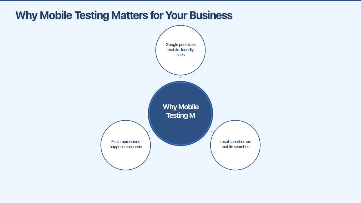
Why Mobile Testing Matters for Your Business
Before diving into the how, let’s understand the stakes. Mobile usability isn’t just a technical checkbox—it directly affects your business success.
Google prioritizes mobile-friendly sites: Since Google’s mobile-first indexing, your site’s mobile version determines your search ranking. Poor mobile experience means lower rankings, which means fewer customers finding you.
Local searches are mobile searches: When someone in Parramatta searches “mechanic near me” or a Castle Hill resident looks up “dentist open Saturday,” they’re almost certainly on their phone. These high-intent searchers expect instant, smooth experiences.
First impressions happen in seconds: Research shows visitors form opinions about websites in about 50 milliseconds. On mobile, if they have to pinch, zoom, or struggle to tap buttons, that impression is negative—and they leave.
For Western Sydney small businesses competing with larger companies and chains, your website often provides your only chance to make a first impression. Mobile testing ensures that impression is positive.
Free Tools to Test Your Mobile Website
You don’t need expensive software or technical expertise to check your website’s mobile performance. These free tools give you actionable insights in minutes.
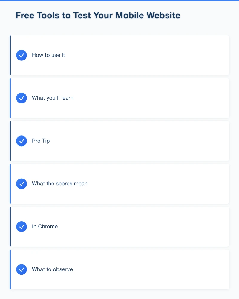
Google’s Mobile-Friendly Test
This is the most important test because it shows you exactly what Google sees.
How to use it:
- Visit search.google.com/test/mobile-friendly
- Enter your website address
- Wait about 30 seconds for results
What you’ll learn: Google tells you whether your page is mobile-friendly and lists specific issues like text too small, clickable elements too close together, or content wider than the screen.
Pro Tip: Test multiple pages, not just your homepage. Your services page, contact page, and any page customers frequently visit should all pass.
Google PageSpeed Insights
Speed and mobile friendliness go hand in hand. This tool measures how fast your site loads on mobile devices.
How to use it:
- Go to pagespeed.web.dev
- Enter your website URL
- Review both mobile and desktop results
What the scores mean:
- 90-100: Excellent (green)
- 50-89: Needs improvement (orange)
- 0-49: Poor (red)
Most small business websites score in the 30-60 range on mobile. That’s not great, but it’s fixable. The tool also provides specific recommendations for improvement.
Browser Developer Tools
Every web browser has built-in tools to simulate how your site looks on different devices.
In Chrome:
- Right-click anywhere on your website
- Select “Inspect”
- Click the device icon (looks like a phone and tablet)
- Choose different devices from the dropdown menu
This lets you see exactly how your website appears on an iPhone, Samsung Galaxy, iPad, and other popular devices. It’s particularly useful for checking how your content reflows on different screen sizes.
Real Device Testing
Nothing beats testing on actual phones. Ask family members or staff to visit your website on their phones and watch what happens.
What to observe:
- Do they have to zoom in to read anything?
- Can they easily tap buttons and links?
- Does the page load quickly on mobile data?
- Can they find your phone number and tap to call?
- Does the contact form work properly?
Real-world testing often reveals issues that automated tools miss, especially around usability and user experience.
Common Mobile Issues and How to Fix Them
When you run these tests, you’ll likely encounter some common problems. Here’s what they mean and how to address them.
Text Too Small to Read
The issue: Your website text looks fine on a computer but appears tiny on phone screens.
The fix: Text should be at least 16 pixels for body content. Your web designer or website platform (WordPress, Wix, Squarespace) should have settings to ensure text scales appropriately.
Quick check: If you need to zoom in to read any text on your phone, it’s too small.
Clickable Elements Too Close Together
The issue: Buttons and links are so close that tapping one accidentally triggers another. This frustrates users, especially on smaller phones.
The fix: Touch targets should be at least 48 pixels in size with adequate spacing between them. Navigation menus are often the worst offenders—if you have many menu items, consider a hamburger menu (the three-line icon) for mobile.
For Western Sydney service businesses: Make sure your phone number is large and easy to tap. A customer trying to call you shouldn’t accidentally tap your email link instead.
Content Wider Than Screen
The issue: Users have to scroll left and right to see everything, not just up and down. This usually means something on your page is too wide for mobile screens.
Common culprits:
- Tables that don’t resize
- Images with fixed widths
- Embedded videos or maps that don’t scale
- Long URLs or text strings that don’t wrap
The fix: All content should be contained within the screen width. Images should resize automatically, tables should scroll horizontally within a container, and text should wrap naturally.
Slow Loading Times
The issue: Your website takes forever to load on mobile, especially on mobile data rather than WiFi.
Why it happens:
- Images that are too large (the #1 cause)
- Too many plugins or scripts
- Poor web hosting
- No browser caching enabled
The fix: Compress images before uploading (tools like TinyPNG are free), remove unnecessary plugins, and consider upgrading your hosting if you’re on the cheapest plan.
Target: Your website should load in under 3 seconds on mobile. Under 2 seconds is ideal.
Intrusive Pop-ups
The issue: Pop-ups that work fine on desktop completely block content on mobile, forcing users to hunt for a tiny close button.
Google’s stance: They penalize websites with intrusive interstitials (pop-ups) that block content on mobile. It hurts both user experience and search rankings.
The fix: Either remove pop-ups on mobile entirely, or ensure they’re easy to dismiss with a large, visible close button. Never use pop-ups that cover the entire screen on mobile devices.
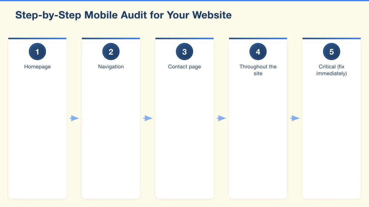
Step-by-Step Mobile Audit for Your Website
Here’s a systematic approach to testing your website. Set aside about 30 minutes and work through each step.
Step 1: Run Automated Tests
Start with Google’s Mobile-Friendly Test and PageSpeed Insights on your homepage. Note any issues flagged.
Step 2: Test Key Pages
Repeat the automated tests on:
- Your services or products page
- Your contact page
- Your about page
- Any landing pages you use for advertising
Step 3: Manual Phone Testing
On your own phone, visit your website and check:
Homepage:
- Does the most important information appear without scrolling?
- Is your value proposition clear?
- Can you navigate to other pages easily?
Navigation:
- Is the menu easy to find and use?
- Do all menu links work?
- Can you get back to the homepage easily?
Contact page:
- Is your phone number clickable (tap to call)?
- Is your address correct?
- Does any contact form work properly?
Throughout the site:
- Is all text readable without zooming?
- Do images display correctly?
- Are there any broken elements or missing content?
Step 4: Test Different Devices
If possible, test on both iPhone and Android devices. Different screen sizes and browsers can produce different results.
Step 5: Document and Prioritise Issues
Make a list of everything you find. Prioritise fixes based on impact:
Critical (fix immediately):
- Pages that don’t load
- Text too small to read
- Contact information hard to find
- Broken forms
High priority (fix this week):
- Slow loading times
- Difficult navigation
- Images not displaying
Medium priority (fix this month):
- Minor layout issues
- Inconsistent styling
What to Do With Your Results
Once you’ve completed your audit, you have three options:
Option 1: DIY Fixes
If your website uses a modern platform like WordPress, Wix, or Squarespace, many mobile issues can be fixed through settings and theme options. Look for:
- Responsive theme settings
- Mobile preview modes
- Image compression options
- Font size adjustments
Most platforms now have mobile-specific settings that let you control how your site appears on smaller screens.
Option 2: Work With Your Web Designer
If you have a web designer or developer, share your audit results with them. A professional can often fix multiple issues quickly because they understand the underlying code.
When discussing fixes, ask about:
- Estimated time and cost for each issue
- Which fixes will have the biggest impact
- Whether a redesign might be more cost-effective than patching
Option 3: Consider a New Website
Sometimes the honest answer is that your website is too outdated to fix efficiently. If your site was built before 2018, wasn’t designed mobile-first, or has accumulated problems over years of patches, starting fresh might be the smarter investment.
Modern websites are built “responsive” from the ground up, meaning mobile friendliness is built into their DNA rather than added as an afterthought.
Ongoing Mobile Monitoring
Mobile testing isn’t a one-time task. Technology changes, and so should your monitoring.
Monthly checks:
- Quick scan of your site on your phone
- Monitor Google Search Console for mobile usability issues
- Check your PageSpeed score hasn’t degraded
After any website changes:
- Test new pages before publishing
- Verify that updates haven’t broken mobile layout
- Check forms and interactive elements still work
When Google announces updates:
- Review any new mobile requirements
- Test against updated standards
- Make adjustments as needed
The Business Impact of Mobile Optimisation
Let’s put this in business terms. For a Western Sydney service business getting 1,000 website visitors per month:
Before mobile optimisation: 60% mobile visitors, 50% bounce rate due to poor mobile experience = 300 lost potential customers
After mobile optimisation: Same traffic, bounce rate drops to 30% = 180 additional visitors engaging with your site
If just 10% of those additional engaged visitors become customers, that’s 18 new customers per month. For most local businesses, even one or two extra customers monthly covers the cost of mobile improvements.
Taking Action Today
Your mobile website experience directly affects whether potential customers contact you or click away to competitors. In Western Sydney’s competitive small business environment, you can’t afford to lose customers to fixable technical issues.
Start with Google’s Mobile-Friendly Test today. It takes 30 seconds and gives you immediate insight into how your site performs. From there, work through the audit process and prioritise fixes based on impact.
Your customers are on their phones right now, searching for businesses like yours. Make sure your website is ready to welcome them.
Need help making your website mobile-friendly? Contact Cosmos Web Technologies for a free mobile audit and recommendations.
Your website’s performance depends on what’s behind it. Cloud Geeks provides the managed hosting, cloud, and IT support that keeps Australian SMBs online and secure.
Ash Ganda covers how Australian SMBs are using AI, automation, and digital strategy to grow without scaling costs proportionally.
If your business is also planning a customer-facing iOS or Android app — Awesome Apps builds cross-platform mobile apps for Australian SMBs.
Part of the Ganda Tech Services family, Cosmos Web Tech delivers specialist web design and digital marketing for Australian small and medium businesses.