Visual Branding Guide for Western Sydney Small Business
Your visual brand is more than just a logo. It is the complete look and feel of your business across every touchpoint, from your website and social media profiles to your business cards, vehicle signage, and shop front. A strong, consistent visual brand builds recognition, communicates professionalism, and helps you stand out in a competitive market.
Whether you are starting a new business in Western Sydney or refreshing an established one, this guide will help you build a visual brand that works.
What Is Visual Branding?
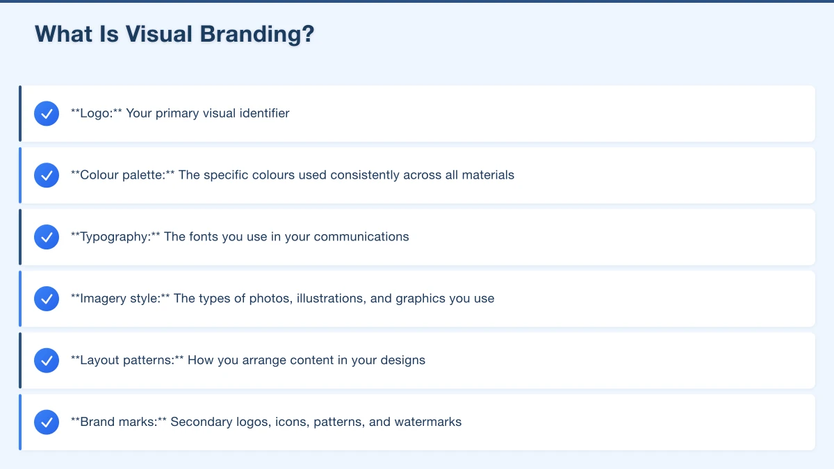
Visual branding encompasses every visual element associated with your business:
- Logo: Your primary visual identifier
- Colour palette: The specific colours used consistently across all materials
- Typography: The fonts you use in your communications
- Imagery style: The types of photos, illustrations, and graphics you use
- Layout patterns: How you arrange content in your designs
- Brand marks: Secondary logos, icons, patterns, and watermarks
Together, these elements create a visual identity that customers recognise and associate with your business.
Why Visual Branding Matters for Local Business
You might think branding is something only big companies need to worry about. But for local businesses, a strong visual brand is actually more important, not less.
Recognition: When someone drives past your van, sees your Facebook ad, and then visits your website, a consistent visual brand creates instant recognition across all three touchpoints.
Professionalism: A polished, consistent look signals a serious, established business. Inconsistent or amateur-looking branding can undermine trust, even if your work is excellent.
Differentiation: In areas like Parramatta, Blacktown, or the Hills District, you are competing with dozens of businesses offering similar services. A distinctive visual brand helps you stand out.
Trust: People trust businesses that look professional. Before they experience your service, your visual brand is all they have to judge you by.
Building Your Colour Palette
Colour is one of the most powerful elements of your brand. It creates emotional associations and makes your business instantly recognisable.
Choosing Your Colours
Start by selecting two to three primary colours and one or two neutral colours. Here is a practical approach:
- Primary colour: This is your main brand colour. It should reflect your industry and the impression you want to create.
- Secondary colour: This complements your primary colour and provides variety in your designs.
- Accent colour: Used sparingly for highlights, buttons, and calls to action.
- Neutrals: White, black, grey, or off-white for backgrounds and text.
Colour Tips
- Use your colours consistently everywhere. Your website, social media, business cards, uniforms, and vehicle wraps should all use the same colours.
- Document your exact colour codes. Record the hex codes (for digital), RGB values, and Pantone or CMYK values (for print). This ensures consistency across different media.
- Test your colours. Make sure they work on both light and dark backgrounds, look good in print, and have enough contrast for readability.
- Consider accessibility. Ensure your text colours have sufficient contrast against background colours for readability.
Selecting Your Typography
The fonts you choose communicate personality just as much as colours do. Most businesses need two to three fonts:
- Heading font: Used for titles and headings. Can be more distinctive or bold.
- Body font: Used for regular text. Should be highly readable.
- Accent font (optional): Used sparingly for special elements like quotes or callouts.
Font Pairing Tips
- Pair a distinctive heading font with a clean, simple body font
- Avoid using more than three fonts
- Make sure your body font is highly readable at small sizes
- Use Google Fonts for free, web-safe options
- License any premium fonts properly for both web and print use
Defining Your Imagery Style
The photos and graphics you use are a core part of your visual brand. Define guidelines for:
Photography Style
Decide on a consistent approach:
- Light and bright versus dark and moody
- Candid and natural versus polished and staged
- Warm tones versus cool tones
- Close-up details versus wide environmental shots
For most local businesses, authentic, well-lit photos of your real team, work, and premises are far more effective than stock photos.
Graphics and Icons
If you use icons, illustrations, or graphic elements, keep them consistent in style:
- Line weight (thin, medium, bold)
- Corner style (rounded, sharp)
- Colour application (filled, outlined)
- Level of detail (simple, detailed)
Creating a Brand Style Guide
A brand style guide documents all your visual branding decisions in one place. It does not need to be elaborate. Even a simple one-page document is valuable.
What to Include
Logo usage:
- Primary logo and any variations
- Minimum size requirements
- Clear space around the logo
- Acceptable and unacceptable uses
Colour palette:
- Primary, secondary, and accent colours
- Hex, RGB, and CMYK values for each
- Examples of colour usage
Typography:
- Font names for headings and body text
- Size guidelines
- Usage examples
Imagery:
- Photography style guidelines
- Examples of appropriate images
- Any graphics or icon style notes
Templates:
- Social media post templates
- Email header templates
- Document templates
Free Tools to Create Your Style Guide
- Canva: Create a simple brand guide document using their templates
- Google Docs: A straightforward text document with colour swatches and font examples
- Coolors: Generate and save colour palettes (coolors.co)
Applying Your Brand Consistently
Consistency is what turns a collection of design choices into a recognisable brand. Apply your visual brand across:
Digital Touchpoints
- Website design
- Social media profiles and posts
- Email newsletters and signatures
- Google Business Profile photos
- Online advertising
Physical Touchpoints
- Business cards
- Letterheads and invoices
- Signage and banners
- Vehicle wraps or magnets
- Uniforms or workwear
- Packaging
Internal Documents
- Proposals and quotes
- Reports
- Presentations
- Internal communications
Brand Consistency on a Budget
You do not need a massive budget to maintain a consistent brand.
Use Canva Brand Kit. Canva Pro (around $18 AUD per month) lets you save your brand colours, fonts, and logos so they are automatically available in every design you create.
Create templates. Design templates for your most common needs (social posts, flyers, invoices) and reuse them. This saves time and ensures consistency.
Brief everyone. Make sure anyone who creates content or materials for your business (staff, freelancers, printers) has your brand guide and understands the importance of following it.
Audit regularly. Every few months, review your materials across all touchpoints. Are they consistent? Has anything drifted off-brand?
Common Branding Mistakes
Inconsistency. Using different colours, fonts, or logo versions in different places confuses customers and weakens your brand.
Too many elements. A brand with five colours, four fonts, and three logo variations looks chaotic. Simplicity is strength.
Copying competitors. Your brand should differentiate you, not blend you in. Be distinct.
Neglecting digital. Your website and social media are often the first things customers see. Make sure they reflect your brand accurately.
Never evolving. While consistency is important, brands can and should evolve over time. A refresh every few years keeps you current without losing recognition.
Your Branding Action Plan
- Define your colour palette (two to three colours plus neutrals)
- Choose your heading and body fonts
- Establish your photography and imagery style
- Create or update your logo if needed
- Document everything in a simple brand guide
- Apply your brand consistently across all touchpoints
- Create templates for commonly used materials
- Share your brand guide with anyone who creates content for your business
Need Help With Your Brand Identity?
At Cosmo Web Tech, we help Western Sydney businesses create professional, consistent brand identities that build recognition and trust. From logo design to complete brand packages including website design, we can help you look the part. Contact us for a free brand consultation.
Your website’s performance depends on what’s behind it. Cloud Geeks provides the managed hosting, cloud, and IT support that keeps Australian SMBs online and secure.
Ash Ganda covers how Australian SMBs are using AI, automation, and digital strategy to grow without scaling costs proportionally.
If your business is also planning a customer-facing iOS or Android app — Awesome Apps builds cross-platform mobile apps for Australian SMBs.
Part of the Ganda Tech Services family, Cosmos Web Tech delivers specialist web design and digital marketing for Australian small and medium businesses.