Web Accessibility Basics for Australian Business Websites
Web accessibility means making your website usable by as many people as possible, including those with disabilities. In Australia, roughly 4.4 million people live with some form of disability. That is nearly one in five Australians. If your website is not accessible, you are potentially excluding a significant portion of your audience.
Beyond the moral case, there are legal and business reasons to care about accessibility. Let us walk through the basics and what you can do to make your business website more accessible.
Why Accessibility Matters
The Legal Landscape in Australia
The Disability Discrimination Act 1992 (DDA) makes it unlawful to discriminate against people with disabilities, and this extends to the provision of goods, services, and information online. The Australian Human Rights Commission has indicated that websites should conform to the Web Content Accessibility Guidelines (WCAG) 2.1 at a minimum of Level AA.
While there have been relatively few legal actions against small businesses for inaccessible websites in Australia, the risk exists. More importantly, the direction of travel is clear: accessibility expectations are increasing.
The Business Case
Accessible websites tend to be better for everyone, not just people with disabilities. Many accessibility improvements also benefit:
- Older users who may have declining vision or motor skills
- People using mobile devices in bright sunlight
- Users with slow internet connections
- People in noisy environments (captions help with video)
An accessible website also tends to be better for SEO. Search engines cannot “see” images or “hear” videos. The same practices that make content accessible to assistive technologies (like alt text and transcripts) help search engines understand your content.
Understanding WCAG
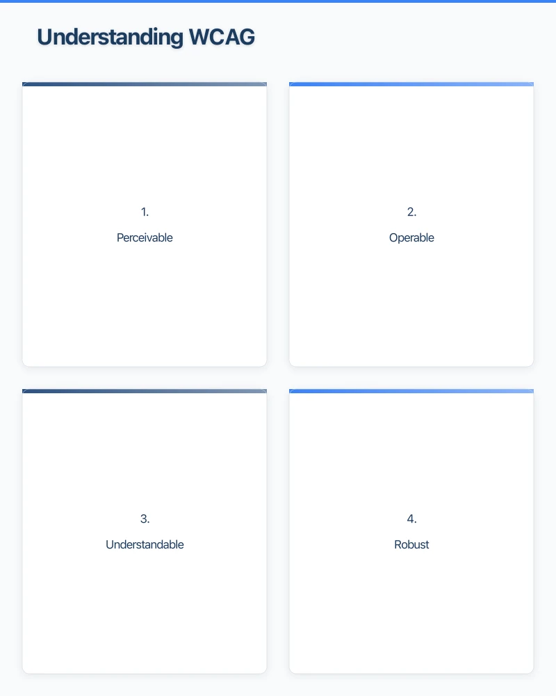
The Web Content Accessibility Guidelines (WCAG) 2.1 are the international standard for web accessibility. They are organised around four principles, often remembered by the acronym POUR:
1. Perceivable
Information and interface components must be presentable to users in ways they can perceive. Not everyone sees, hears, or reads the same way.
2. Operable
Interface components and navigation must be operable. Not everyone uses a mouse. Some people navigate using a keyboard, voice commands, or other assistive devices.
3. Understandable
Information and the operation of the interface must be understandable. Content should be readable and predictable.
4. Robust
Content must be robust enough to be interpreted by a wide variety of user agents, including assistive technologies like screen readers.
Practical Accessibility Steps for Your Website
You do not need to become an accessibility expert overnight. Here are the most impactful changes you can make:
Add Alt Text to All Images
Alt text (alternative text) is a description of an image that screen readers read aloud to visually impaired users. It also appears when an image fails to load.
Good alt text:
- Describes what the image shows: “Team photo of Cosmo Web Tech staff outside our Parramatta office”
- Is concise: aim for a sentence or two
- Conveys the purpose of the image: if the image is a button, describe its function
Bad alt text:
- Empty alt text on meaningful images
- Generic descriptions like “image” or “photo”
- Keyword-stuffed descriptions written for SEO rather than users
For decorative images that do not convey meaningful content, use an empty alt attribute (alt="") so screen readers skip them.
Ensure Sufficient Colour Contrast
Text must have enough contrast against its background to be readable by people with low vision or colour blindness. WCAG 2.1 Level AA requires:
- A contrast ratio of at least 4.5:1 for normal text
- A contrast ratio of at least 3:1 for large text (18pt or 14pt bold)
Use a free tool like the WebAIM Contrast Checker to test your colour combinations. Light grey text on a white background, for example, is a common problem on many business websites.
Make Your Website Keyboard Navigable
Some people cannot use a mouse and navigate using only a keyboard. Make sure:
- All interactive elements (links, buttons, forms) can be reached using the Tab key
- The current focus position is visible (a visible outline around the focused element)
- Drop-down menus and modal windows work with keyboard navigation
- There are no keyboard traps (situations where a user cannot Tab away from an element)
Test this yourself: try navigating your website using only your keyboard (Tab, Enter, and arrow keys).
Use Proper Heading Structure
Screen reader users often navigate by headings, jumping from heading to heading to find the content they want. Your heading structure should be:
- H1: One per page, your main page title
- H2: Major sections
- H3: Subsections within H2 sections
- H4 and beyond: Further subsections as needed
Do not skip heading levels (going from H1 directly to H3, for example). Do not use headings purely for visual styling. If you want larger text, use CSS rather than a heading tag.
Write Descriptive Link Text
“Click here” and “Read more” tell screen reader users nothing about where a link goes. Instead, use descriptive link text:
- Instead of “Click here to view our services,” use “View our web design services”
- Instead of “Read more,” use “Read our guide to local SEO”
The link text should make sense even when taken out of context.
Make Forms Accessible
Contact forms are critical for many business websites. Make them accessible by:
- Adding labels to every form field (not just placeholder text)
- Using clear error messages that explain what went wrong and how to fix it
- Grouping related fields logically
- Making sure forms can be completed using only a keyboard
- Indicating required fields clearly
Provide Captions and Transcripts for Video
If you have videos on your website, provide captions for deaf and hard-of-hearing users. YouTube and other platforms offer automatic captioning, though you should review and correct auto-generated captions for accuracy.
For audio-only content like podcasts, provide a text transcript.
Use Readable Fonts and Sizes
- Use a minimum font size of 16 pixels for body text
- Choose fonts that are easy to read (avoid overly decorative fonts for body text)
- Ensure adequate line spacing (at least 1.5 times the font size)
- Allow users to resize text without breaking the layout
Ensure Responsive Design
Your website should work well at any screen size and zoom level. Many users with low vision zoom in on content, sometimes to 200 percent or more. Your layout should accommodate this without content being cut off or overlapping.
Testing Your Website’s Accessibility
Automated Testing Tools
Several free tools can scan your website for common accessibility issues:
- WAVE (Web Accessibility Evaluation Tool): A browser extension that highlights accessibility issues on any web page
- axe DevTools: A browser extension for developers that provides detailed accessibility audit results
- Google Lighthouse: Built into Chrome’s developer tools, it includes an accessibility audit
These tools catch many issues but cannot test everything. They are a good starting point but should not be your only testing method.
Manual Testing
Some accessibility issues can only be found through manual testing:
- Navigate your website using only a keyboard
- Try using your website with a screen reader (VoiceOver is built into Mac and iPhone, TalkBack is built into Android)
- Test your website at 200 percent zoom
- Check your content with images turned off
User Testing
If possible, get feedback from people who use assistive technologies. Their real-world experience will reveal issues that tools and manual testing miss.
Common Accessibility Mistakes
Relying only on colour to convey information. If you use red to indicate errors, also include an icon or text label. Colour-blind users may not see the colour distinction.
Using images of text. Text within images cannot be read by screen readers, resized by users, or translated by browser tools. Use real text whenever possible.
Auto-playing media. Audio or video that plays automatically can be disorienting and disruptive, especially for screen reader users. Always let users choose to play media.
Poor form validation. Error messages like “Invalid input” are not helpful. Specify what went wrong: “Please enter a valid email address” is much clearer.
Missing skip navigation link. Screen reader and keyboard users should be able to skip past your navigation menu to get to the main content. A “Skip to main content” link at the top of each page makes this possible.
Getting Started
You do not need to fix everything at once. Start with the highest-impact changes:
- Add alt text to all images
- Check colour contrast
- Ensure keyboard navigation works
- Fix heading structure
- Make forms accessible
Then work through the remaining items over time. Every improvement makes your website more usable for more people.
Need Help?
At Cosmo Web Tech, we build websites with accessibility in mind from the start. If your existing website needs accessibility improvements, we can audit your site and help you prioritise and implement changes. Reach out to our team to discuss how we can make your website work for everyone.
Your website’s performance depends on what’s behind it. Cloud Geeks provides the managed hosting, cloud, and IT support that keeps Australian SMBs online and secure.
Ash Ganda covers how Australian SMBs are using AI, automation, and digital strategy to grow without scaling costs proportionally.
If your business is also planning a customer-facing iOS or Android app — Awesome Apps builds cross-platform mobile apps for Australian SMBs.
Part of the Ganda Tech Services family, Cosmos Web Tech delivers specialist web design and digital marketing for Australian small and medium businesses.