Why Every Small Business Needs a Mobile-Friendly Website
Here is a number that should get your attention: over half of all web traffic in Australia now comes from mobile devices. That means if your business website does not work well on a phone, you are potentially turning away more than half your visitors before they even see what you offer.
Yet we still see many small business websites across Western Sydney that are difficult or impossible to use on a mobile device. Tiny text you have to pinch to zoom. Buttons too small to tap. Pages that take forever to load on a mobile connection. Menus that are impossible to navigate.
If any of that sounds like your website, this post is for you.
What Does “Mobile-Friendly” Actually Mean?
A mobile-friendly website (also called a responsive website) automatically adjusts its layout and content to fit the screen it is being viewed on. Whether someone visits on a desktop computer, a tablet, or a smartphone, the site looks good and functions properly.
This means:
- Text is readable without zooming in
- Buttons and links are easy to tap with a finger
- Images resize appropriately
- Navigation is simple and intuitive
- Forms are easy to fill out on a small screen
- The site loads quickly on mobile data connections
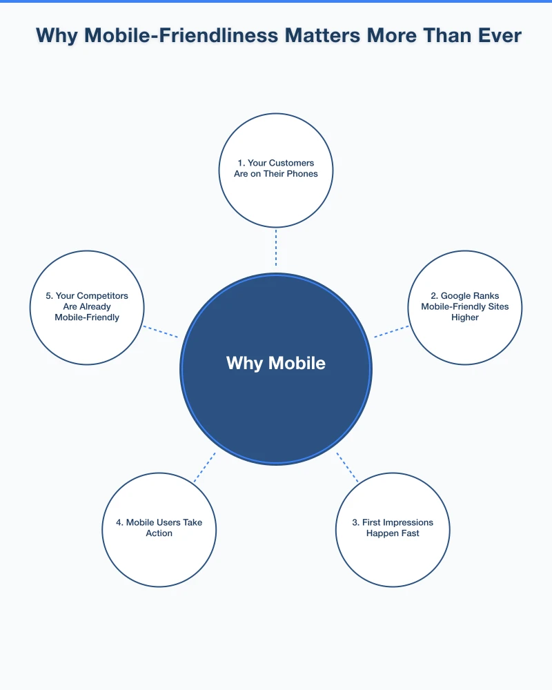
Why Mobile-Friendliness Matters More Than Ever
1. Your Customers Are on Their Phones
Think about how you use the internet yourself. When you need a quick answer, want to find a local business, or need to look something up while you are out, you reach for your phone. Your customers do the same thing.
For local businesses especially, mobile usage is even higher. People searching for “plumber near me” or “cafe open now” are almost always on their phones, often while they are out and about.
2. Google Ranks Mobile-Friendly Sites Higher
Google has been moving toward mobile-first indexing, which means Google primarily uses the mobile version of your website for ranking and indexing. If your site is not mobile-friendly, it will likely rank lower in search results — even for people searching on desktop computers.
This is not a future possibility. It is happening now. Google has been rolling out mobile-first indexing for all websites, and if your site is not ready, your search visibility will suffer.
3. First Impressions Happen Fast
Research shows that visitors form an opinion about a website within seconds. If someone lands on your site from their phone and has to pinch and zoom, struggle with navigation, or wait for a slow page to load, they are going to hit the back button and visit your competitor instead.
You never get a second chance at a first impression, and increasingly, that first impression happens on a mobile device.
4. Mobile Users Take Action
People browsing on mobile devices are often ready to act. They want to call you, get directions to your location, fill out a contact form, or make a purchase. A mobile-friendly website makes it easy for them to do exactly that.
A click-to-call button, a link to Google Maps, and a simple contact form can turn a mobile visitor into a paying customer in minutes.
5. Your Competitors Are Already Mobile-Friendly
If your website is not mobile-friendly but your competitors’ sites are, guess who the customer is going to choose? The business with the site they can actually use on their phone.
The competitive landscape has shifted. Mobile-friendliness is no longer a nice-to-have. It is the baseline expectation.
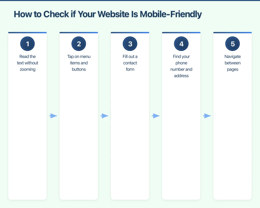
How to Check if Your Website Is Mobile-Friendly
Google offers a free tool called the Mobile-Friendly Test. Simply enter your website URL and Google will tell you whether your site passes the test and highlight any issues.
You can also simply pull out your phone and browse your own website. Try to:
- Read the text without zooming
- Tap on menu items and buttons
- Fill out a contact form
- Find your phone number and address
- Navigate between pages
If any of these tasks are difficult, your site needs work.
Common Mobile Problems and How to Fix Them
Text Too Small to Read
Your body text should be at least 16 pixels on mobile. If visitors need to zoom in to read your content, the text is too small.
Buttons and Links Too Close Together
On a touchscreen, people tap with their fingers, not a mouse cursor. Buttons and links need enough space around them so people do not accidentally tap the wrong thing. A minimum tap target of about 44 by 44 pixels is a good rule of thumb.
Horizontal Scrolling
If your website requires horizontal scrolling on mobile, something is wrong. Content should fit within the screen width and scroll vertically only.
Slow Load Times
Mobile connections can be slower than home broadband. Large images, heavy scripts, and too many plugins can make your site painfully slow on mobile. Aim for a load time of under three seconds.
Flash Content
If your website still uses Flash for any content or animations, it will not work on mobile devices at all. Flash is no longer supported by most browsers. Any Flash content needs to be replaced with modern alternatives.
Unplayable Videos
Make sure any videos on your site use HTML5 video players that work across all devices, not outdated formats.
Making Your Website Mobile-Friendly
Option 1: Responsive Redesign
The best approach is a fully responsive website that adapts to any screen size. If your site is more than a few years old, a redesign is often the most effective option. Modern website builders and content management systems like WordPress create responsive sites by default.
Option 2: Update Your Current Theme or Template
If your website is built on WordPress or a similar platform, you may be able to switch to a responsive theme without rebuilding your entire site. This can be a cost-effective middle ground.
Option 3: Mobile Plugin or Add-On
Some platforms offer plugins that create a simplified mobile version of your site. While this is better than nothing, a fully responsive design is always the preferred approach.
Mobile-Friendly Design Best Practices
Here are some additional tips for creating a great mobile experience:
- Simplify navigation: Use a hamburger menu (the three-line icon) for mobile navigation. Keep your menu items focused and easy to scan.
- Make phone numbers tappable: On mobile, people should be able to tap your phone number to call directly.
- Use large, clear calls to action: “Call Now,” “Get a Quote,” or “Book Online” buttons should be prominent and easy to tap.
- Optimise images: Compress images so they load quickly without sacrificing too much quality.
- Test on real devices: Do not just test on one phone. Try different screen sizes and both Android and iPhone if possible.
- Keep forms short: Nobody wants to fill out a 15-field form on their phone. Ask only for essential information.
The Business Impact
A mobile-friendly website directly impacts your bottom line:
- Higher search rankings mean more visibility
- Better user experience means visitors stay longer
- Easy contact options mean more enquiries and calls
- Fast load times mean fewer people leaving before the page loads
- Professional appearance builds trust and credibility
For a local Western Sydney business, the majority of your potential customers are likely finding you on their phones. If your website does not work well on mobile, you are losing business every single day.
Take Action Today
If your website is not mobile-friendly, do not wait. Every day you delay is a day of lost opportunities. Here is what to do:
- Test your website using Google’s Mobile-Friendly Test
- Browse your own site on your phone and note any problems
- Talk to your web developer about making your site responsive
- If your site is very outdated, consider a fresh redesign with mobile as the priority
Investing in a mobile-friendly website is not an expense. It is an investment that pays for itself through increased visibility, more enquiries, and happier customers.
Your customers are on their phones. Make sure your website is ready for them.
Your website’s performance depends on what’s behind it. Cloud Geeks provides the managed hosting, cloud, and IT support that keeps Australian SMBs online and secure.
Ash Ganda covers how Australian SMBs are using AI, automation, and digital strategy to grow without scaling costs proportionally.
If your business is also planning a customer-facing iOS or Android app — Awesome Apps builds cross-platform mobile apps for Australian SMBs.
Part of the Ganda Tech Services family, Cosmos Web Tech delivers specialist web design and digital marketing for Australian small and medium businesses.